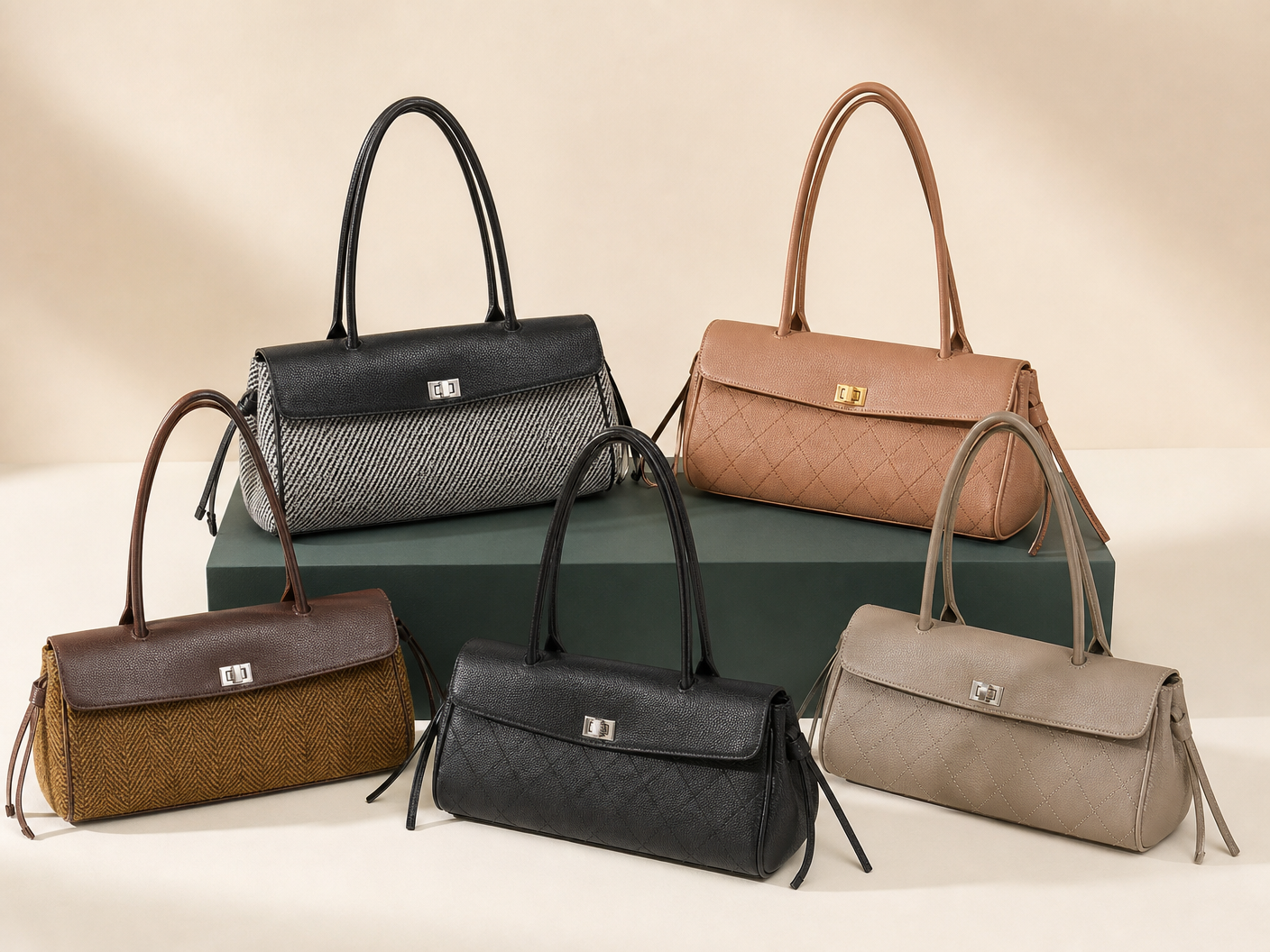
A strong color range has hierarchy. Core shades carry continuity, supporting shades widen use, and accents create seasonal interest without forcing every SKU into every color.
Use this guide alongside East-west bag collection when choosing the initial direction. The Material and finish planning page covers the next specification or development layer.
Assign core neutral and accent color roles
Start with the commercial job of each color, not a long list of attractive swatches.
Core colors support repeat wear and broader channels. Supporting neutrals add warmth or depth. Accent colors should connect to a launch story and a specific SKU plan.
- Label colors as core, support or accent.
- Limit near-duplicate neutrals unless channels differ.
- Review the full range together, not shade by shade.
Review material-finish interaction with color
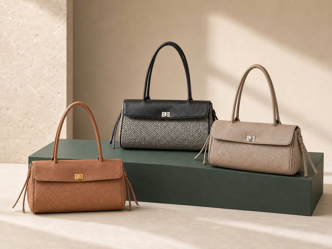
The same color can look different on smooth, pebbled and suede-look surfaces.
Gloss level, pile direction, grain and edge paint can shift perceived saturation and depth. Approve physical material cuttings under the lighting used for product review.
- Keep material and color codes connected.
- Check hardware finish beside every approved shade.
- Review edge paint and lining as part of the palette.
Connect color choices to SKU and MOQ planning
Every added color increases the number of material, trim, sample and inventory decisions.
Bloomery’s approved operating profile uses a planning MOQ range of 100–300 pieces per style and color, subject to the project. Use that range as an early planning input, not a universal promise.
- Model quantity by style-color combination.
- Share materials across styles when the visual result remains coherent.
- Avoid an accent color without a launch and channel role.
Run a seasonal range review
Review the range for hierarchy, duplication and coordination before sampling every option.
The best palette may use fewer colors with stronger distribution across hero, support and test SKUs. Compare the plan with apparel, packaging and campaign direction.
- Identify the hero color for campaign imagery.
- Check whether each neutral is visibly distinct.
- Keep a cancellation rule for weak sample colors.
Decision tool
Color-role planning matrix
| Color role | Commercial purpose | Approval focus |
|---|---|---|
| Core neutral | Continuity and broad wearability | Repeatability across materials and batches |
| Supporting neutral | Warmth, depth or channel variation | Clear distinction from the core shade |
| Seasonal accent | Campaign interest and trend response | Material behavior and controlled SKU exposure |
| Test color | Limited learning opportunity | Defined quantity, channel and cancellation rule |
Before you brief a supplier
Buyer checklist
- Color role assigned to every shade
- Physical approval on intended material
- Hardware, edge and lining coordination
- Style-color quantity matrix